ESPN NBA EDIT TOOLKIT
Skip to 0:45 to avoid walkthrough
CASE STUDY
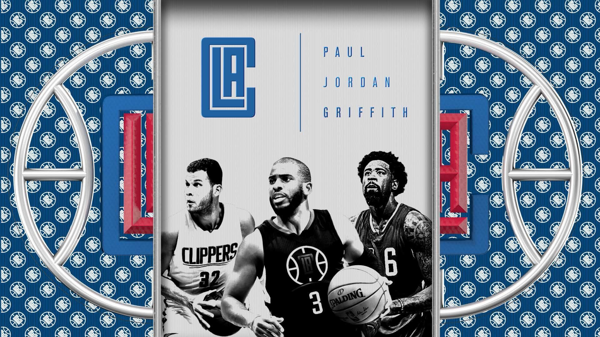
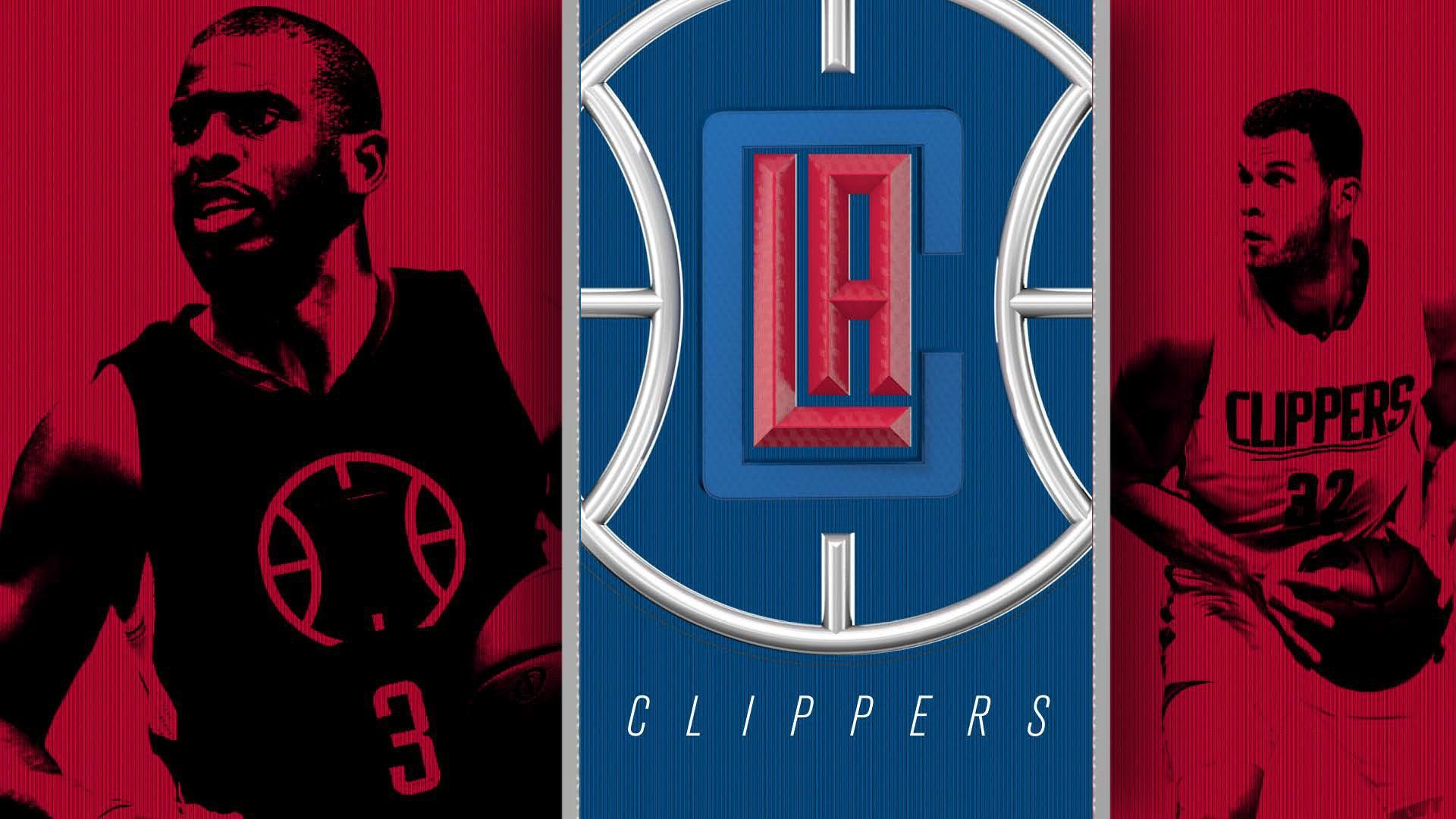
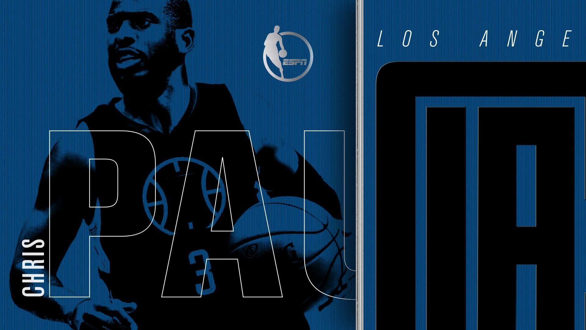
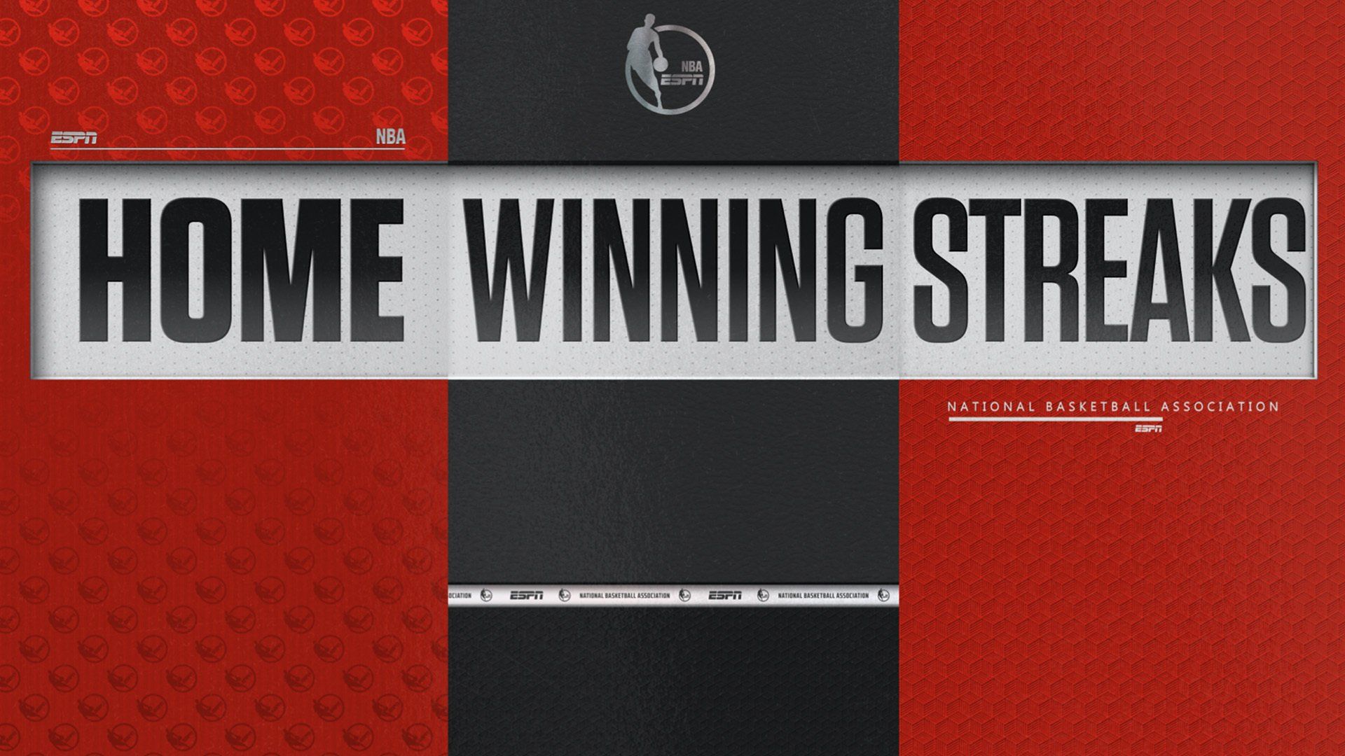
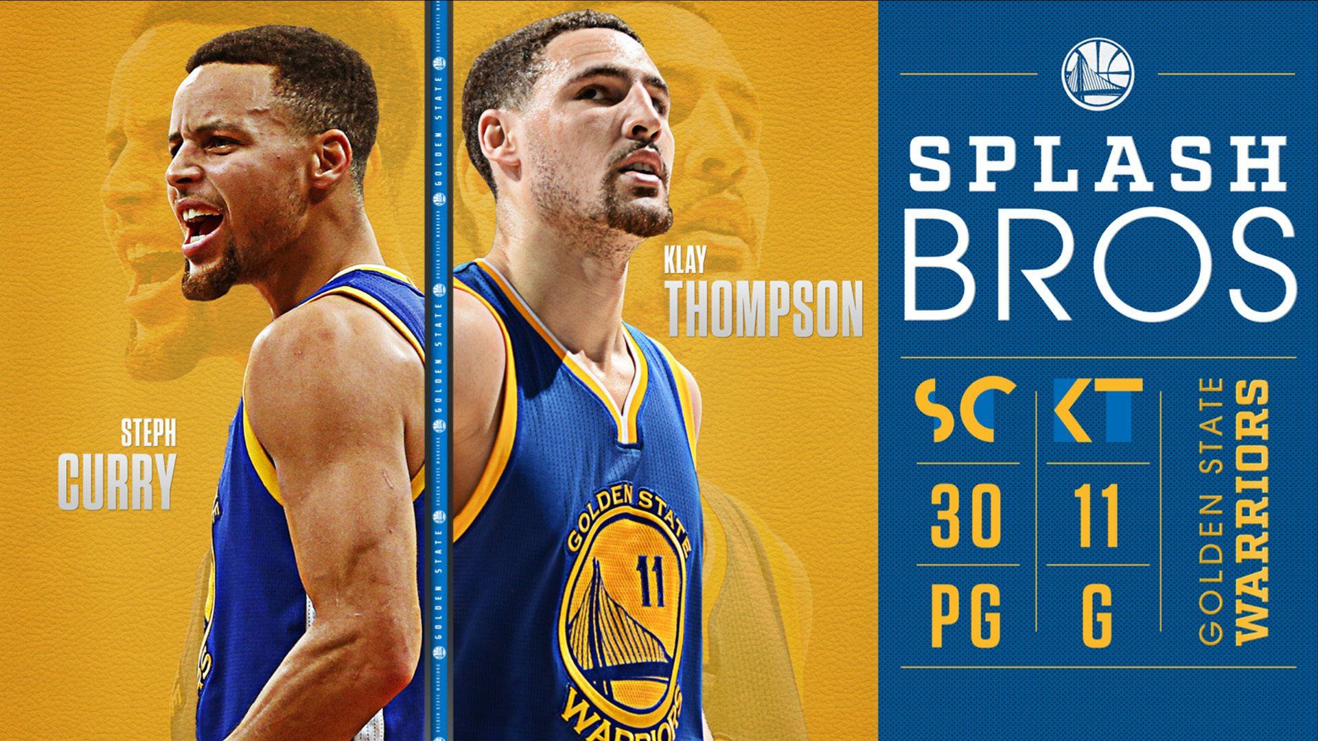
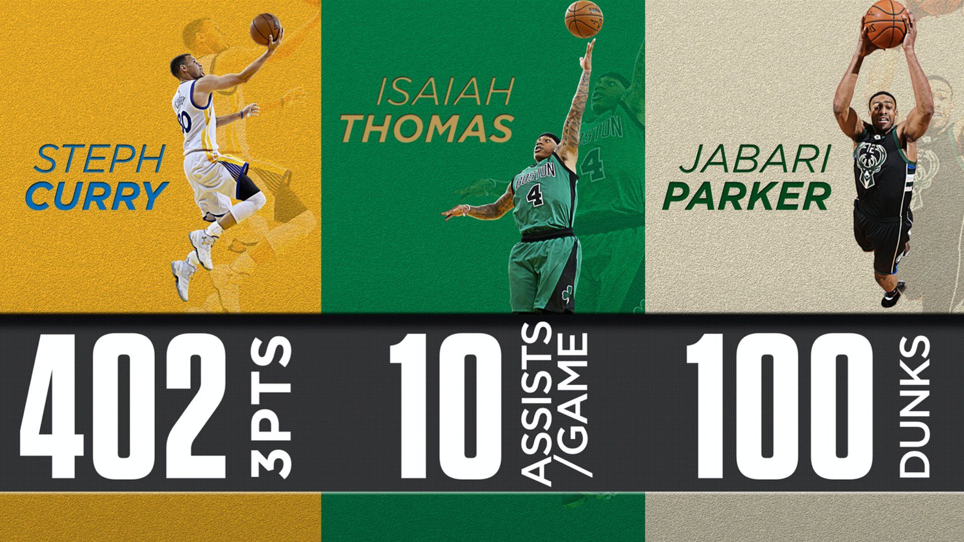
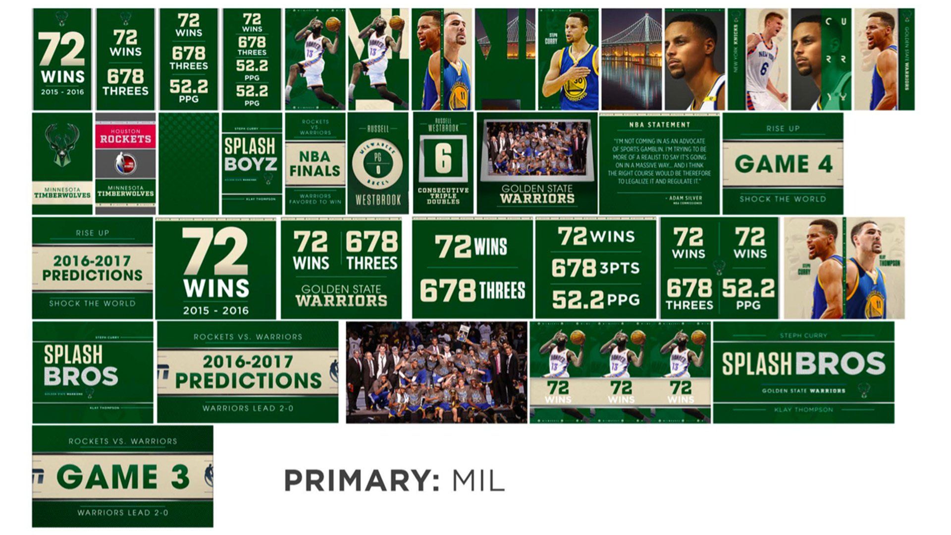
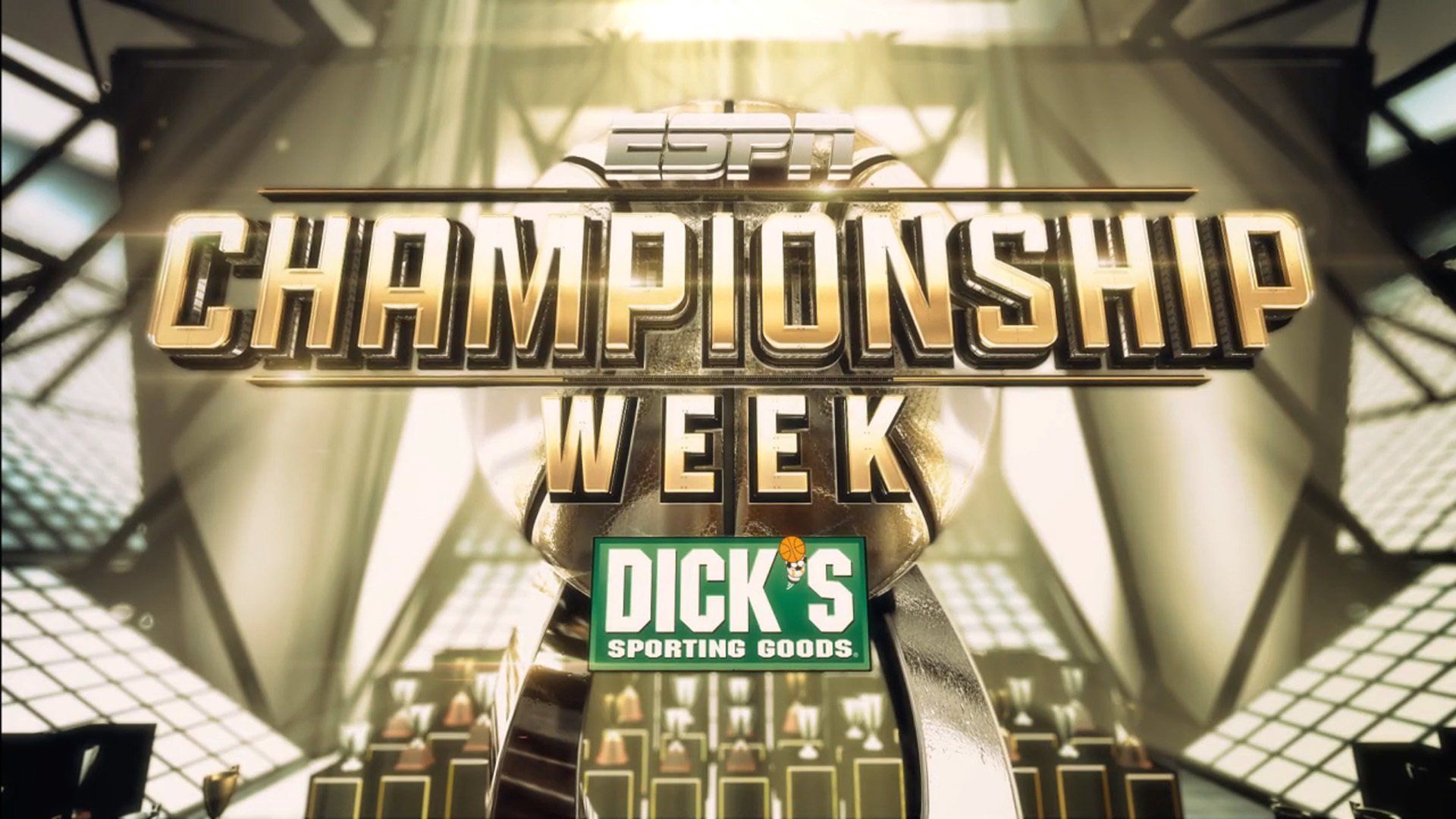
In 2016, after about a year of development, ESPN Creative Services in partnership with Big Block released the new NBA on ESPN brand campaign. It was designed to reflect the luxury brand style of many of the players in the NBA at the time, using bright colors, custom 3D logos, and a high tactile quality. As part of their normal broadcast, there's a production team dedicated to creating spotlight content for something like a rookie player, or someone on a hot streak. Often times, these editors would purchase and utilize After Effects templates that they bought online, which never reflected the greater overall NBA branding look. My task was to come up with an After Effects toolkit that would be easily editable and quick to render, while reflecting the new brand campaign.
THE CHALLENGE
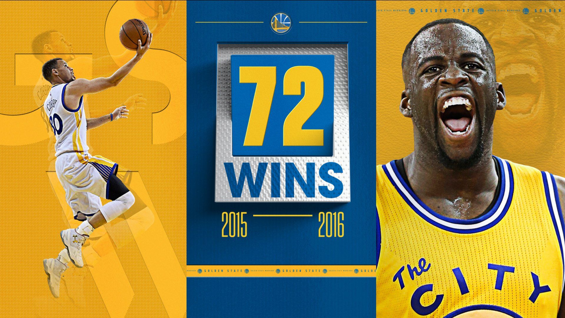
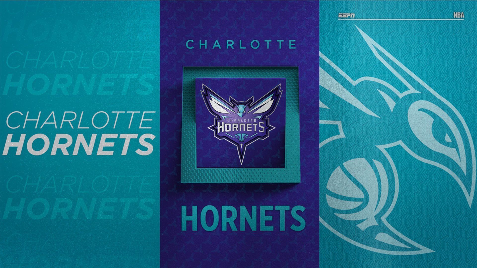
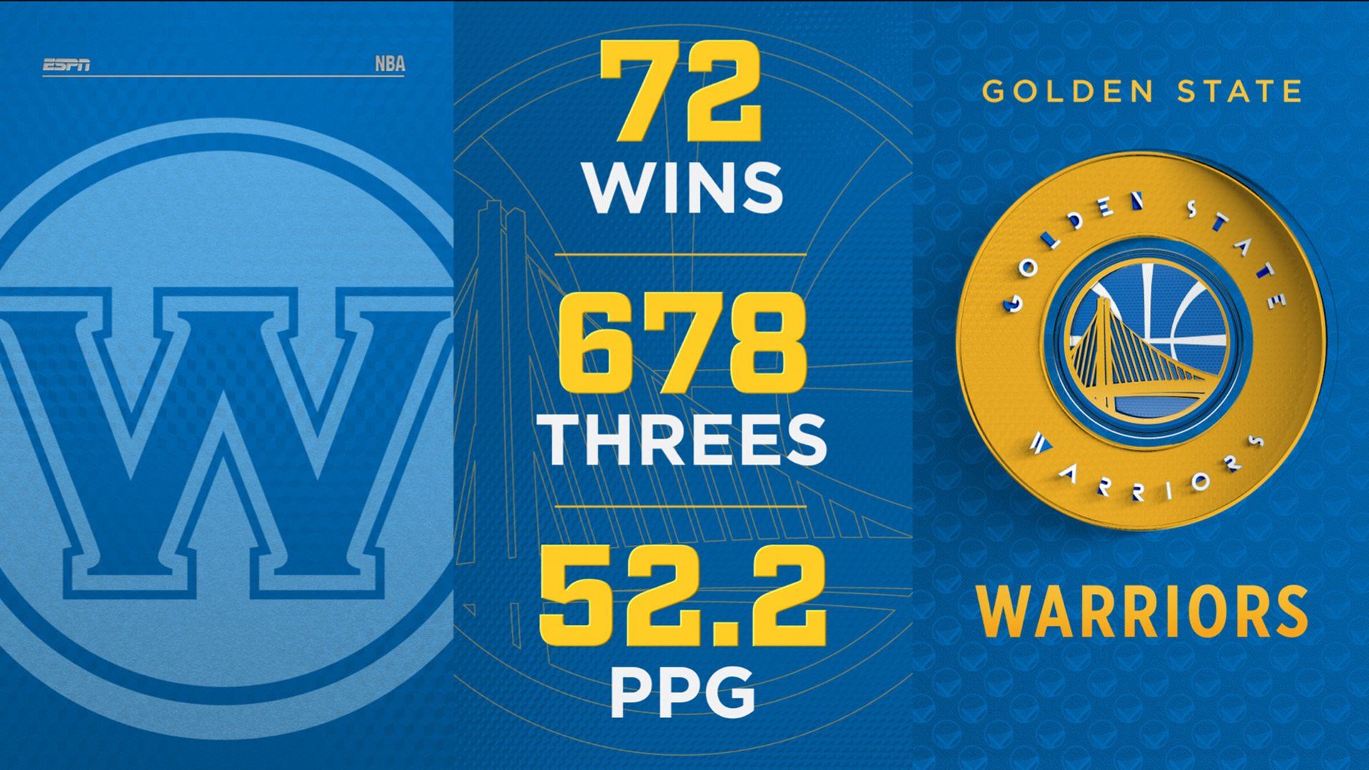
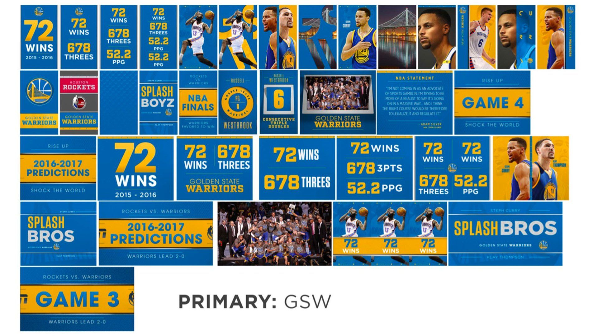
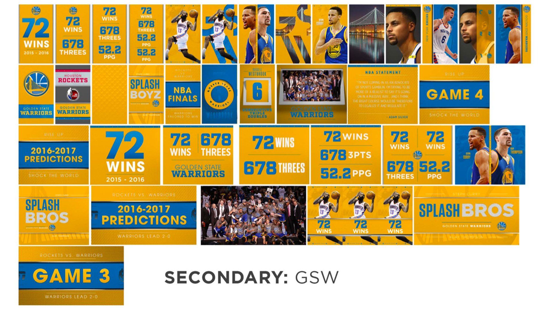
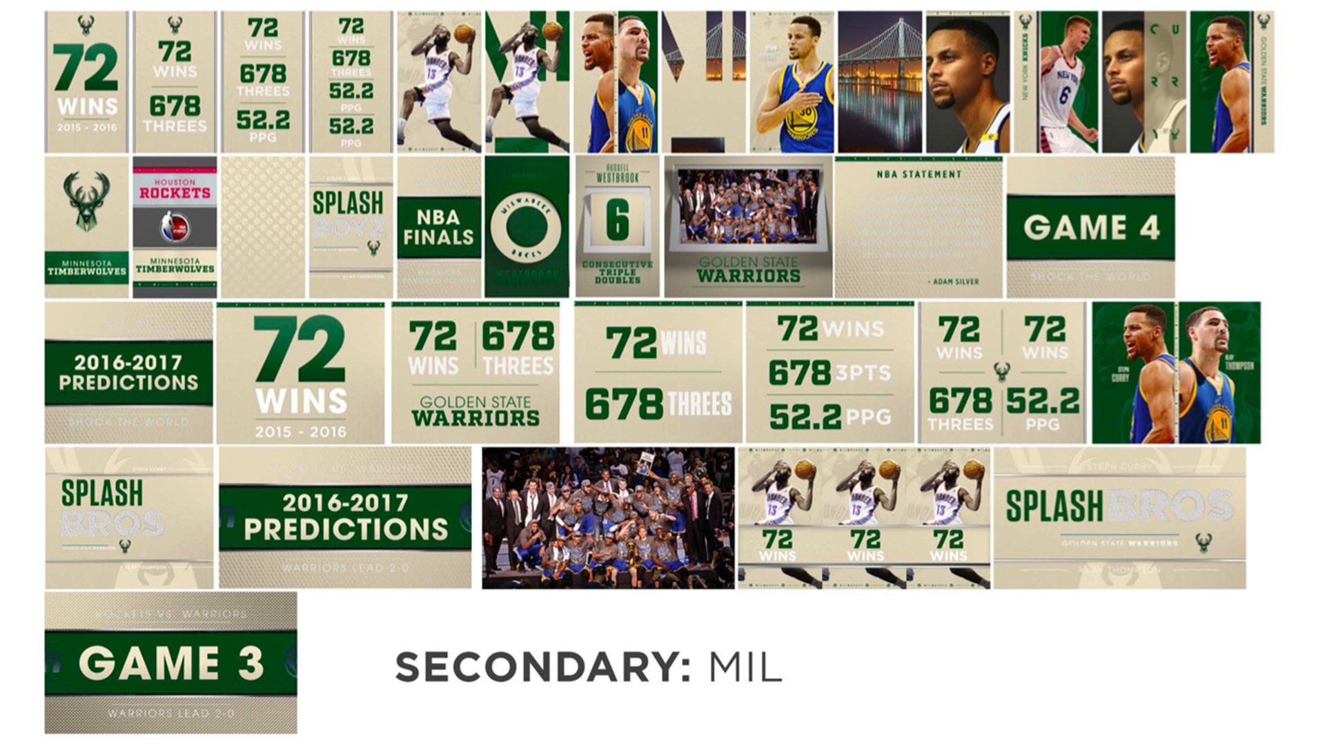
We knew we need a variety of designs that were modular in nature and were easily editable in AE, so large 3D sequences were out of the question. Looking across the diverse set of design elements that were created and not implemented by the design team, we zeroed in on a triptych idea which was ripe for exploring. The triptych concept allowed us to use small design compositions in different ways to create different looks, while also allowing us to create two panel and full screen designs that worked with the modular setup. Folding and animating the various pieces in simple ways allowed us to achieve a look that still felt 3D even though they were flat panels.
THE PROCESS
Taking some initial concepts provided by Big Block for ideas that weren’t used, I start by trying to make stuff that looked cool. I looked to high end packaging design to inspire new ideas. I mashed up patterns and logos to see what kind of combinations looked interesting, but still maintained hierarchy among the other potential designs combinations it would be paired with. Once I had a handful of designs to work with, I began creating modular animations in AE, utilizing 3D layers, track mattes and null objects to move designs across the screen, creating 10-20 animations that could be layered on top of one another in different ways so that no two animations created by the editors looked alike.
Once the overall look and animations were approved we set upon scripting the toolkit. We wanted to avoid having an editor go through and change colors, or team logos in a variety of color formats. Not only because they didn’t have time to customize every design, but the people using the toolkit were editors, not designers. The solution for this was to create a main composition that helped drive all of the design changes so that the editors didn’t have to think about it. Turning a team on or off would switch all of the necessary logos and team ribbons used in almost every design element. We used another comp with team centered color swatches that our scripting could then pull color information from. When needed, the editor could flip another switch to set the team to their “away” colors, or even allow them to choose custom colors that were then applied across every design.
THE RESULTS
Not only was the toolkit well received by the editors who loved how cool everything looked and how little they had to work with it to create something interesting and unique, but Dan Ben-Kiki and I had the same "holy shit" moment. While individually watching the same broadcast we both saw an animation play that hadn't been created by me and looked like something I could have done. That was proof enough that the toolkit was a success, but as a bonus, the insert graphic group who often create custom graphics specific to each game were able to adapt what I'd built to their own VizRT systems.
CREDITS
Initial Design Concept:
ESPN Creative Services
Big Block
Art Direction: Daniel Ben-Kiki
Toolkit Design and Animation: Matthew Gasiorowski
Toolkit Scripting: Mark Rohrer

